Case study, freelance
He asked for one page.
I shipped him a business.
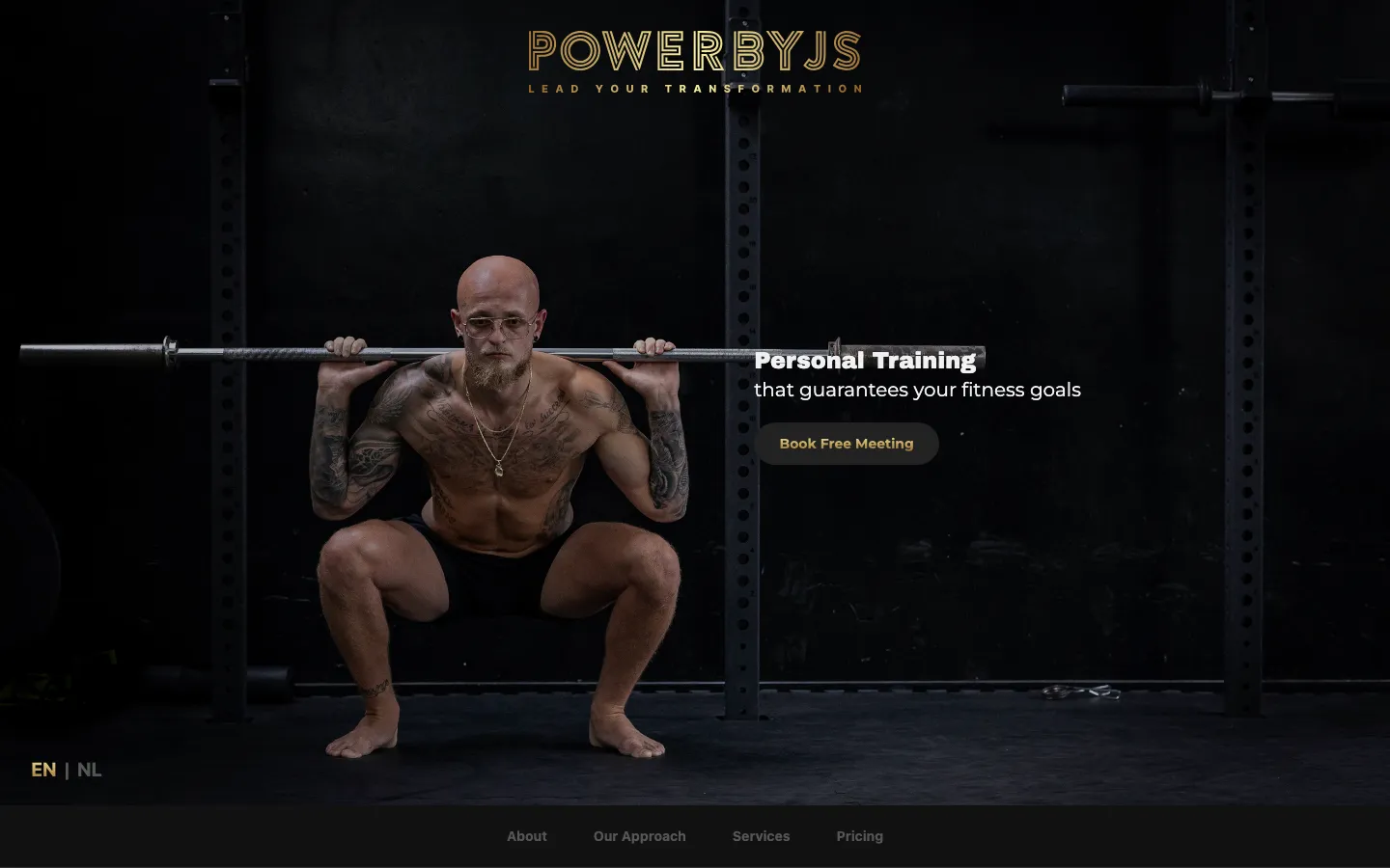
Jessy Schneider coaches kickboxing and holistic health in Haarlem. He came to me for a one page website. I researched the market he was competing in first, found that one page would lose, and built what the business actually needed: a brand, eight bilingual pages, and three pricing calculators wired straight into his inbox.
01
The brief
“CMS, to be able to update website autonomously in the future. For now we want only 1 website.”
He had a logo he did not like, no copy, no brand and no site. New clients reached him through Instagram direct messages, which meant every enquiry started with him explaining what he offered and what it cost, one message at a time.
What he asked for was one page and a way to edit it himself. The straightforward job was to build exactly that. I did the research first anyway, because a page is only worth building once you know what it has to beat.
02
Why one page would have lost
I studied the personal training market around Haarlem and Amsterdam before drawing anything. Three competitors set the standard his prospects were unconsciously measuring him against.
Sells on data
Ultimate Performance
Amsterdam
Personalised plans built from over 150 tracked data points, documented transformations and formal accountability systems.
Sells on environment
Omnia Personal Training
Amsterdam
A luxury training studio, holistic programmes covering both physical and mental wellbeing, and a premium price to match.
Sells on community
Gym Haarlem
Haarlem
A strong local presence on his doorstep, tailored group classes and the familiarity of a gym people already belong to.
Jessy charges premium rates and earns them. Against those three, though, a single page with a contact form does not read as the cheaper option, it reads as the less serious one. The gap was never design taste. It was credibility, and credibility is cumulative: it comes from being able to answer the questions a careful buyer asks before they will spend a four figure sum on a stranger.
So I told him the brief was wrong, and why. He agreed to the larger scope on the understanding that I would show the reasoning at every step rather than disappear and come back with opinions.
03
Who we were selling to
Four personas, drawn from his actual client base rather than invented. Each carries demographics, goals, obstacles, engagement preferences and how they map onto his coaching pillars.
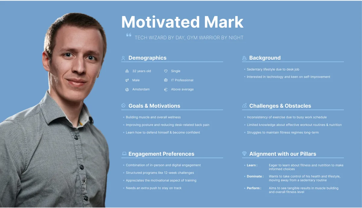
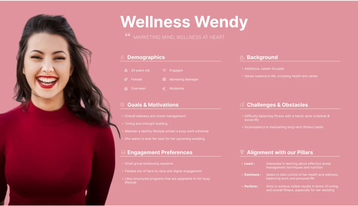
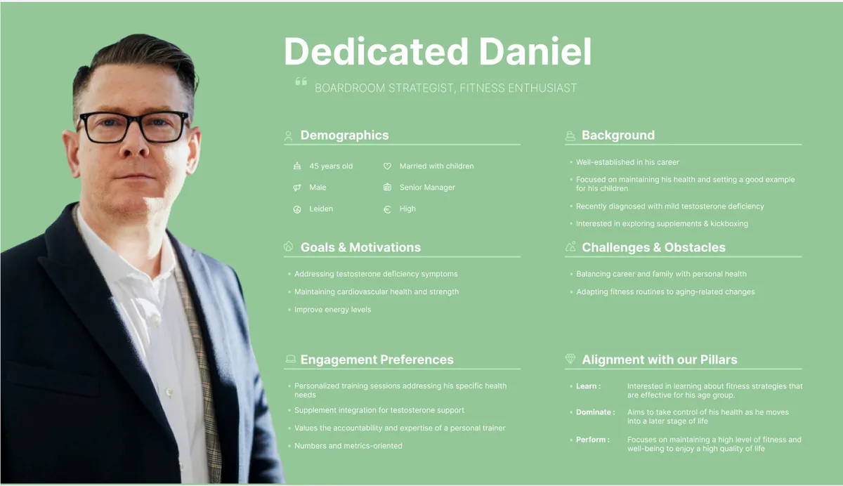
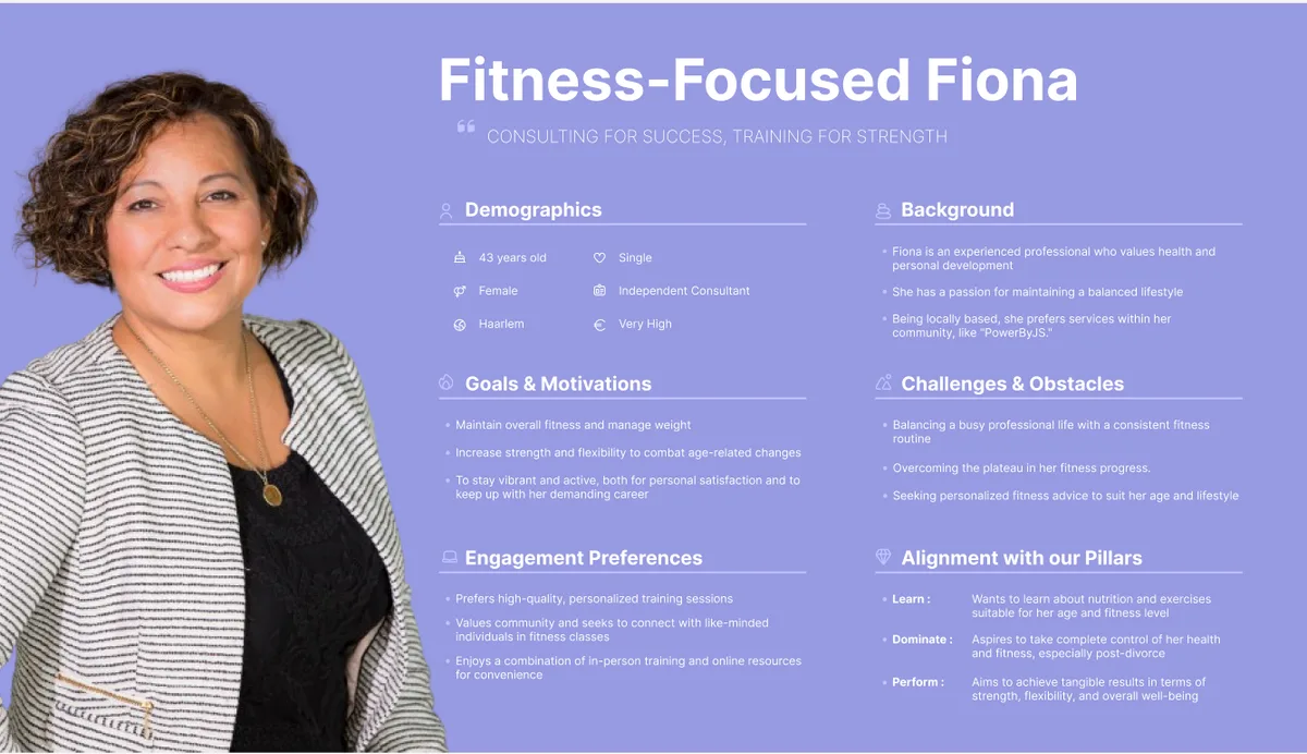
These were not decoration for a slide deck. Daniel and Fiona are time poor and buy expertise, so pricing had to be legible without a phone call. Mark needs structure, which is why the twelve week programmes are sold as programmes rather than as sessions. Wendy does not identify as an athlete, so the copy never assumes she does. The personas decided the page structure and the tone before a single screen was designed.
04
The brand
He arrived with a logo he did not like. He left with an identity, and with a document that lets the next person he hires apply it without asking me first.


The old mark was a hairline script. At a glance it reads as a signature rather than as a strength coach, and the strokes are thin enough that it closes up in a favicon and disappears entirely once anyone tries to print it. A logo for this business has to survive being embroidered on a hoodie in a badly lit gym. That was the argument, and it is easier to see than to make.
;%20}%20%3c/style%3e%3cradialGradient%20id='radial-gradient'%20cx='1027.6'%20cy='529.82'%20fx='1027.6'%20fy='529.82'%20r='44.23'%20gradientTransform='translate(-1207.42%20-1359.17)%20scale(1.23%202.67)'%20gradientUnits='userSpaceOnUse'%3e%3cstop%20offset='.14'%20stop-color='%23faf19f'/%3e%3cstop%20offset='.67'%20stop-color='%238f5e25'/%3e%3c/radialGradient%3e%3c/defs%3e%3cg%20id='PowerByJS'%3e%3cg%3e%3crect%20class='cls-1'%20x='0'%20y='0'%20width='115.61'%20height='115.61'%20rx='57.8'%20ry='57.8'/%3e%3cpath%20id='Logo'%20class='cls-2'%20d='m58.33,79.27c2.18,1.05,4.16,2.23,6.26,2.95,2.67.92,5.42,1.89,8.19,2.11,6.66.52,12.13-1.64,15.2-8.66,3.15-7.22.1-15.83-6.78-19.11-2.5-1.19-5.11-2.08-7.64-3.19-1.45-.64-2.91-1.33-4.24-2.23-2.44-1.65-3.28-3.98-2.68-6.8.56-2.64,2.65-4.64,5.29-5,2.7-.36,5.29.26,7.81,1.22,2.03.78,4,1.7,6.12,2.61.37-.59.75-1.21,1.32-2.11-2.25-1.04-4.32-2.16-6.49-2.96-2.95-1.1-5.97-1.71-9.16-1.21-3.25.51-6.15,2.94-7.08,6.34-.95,3.48.07,6.98,2.73,9.33,2.21,1.95,4.86,2.85,7.49,3.85,1.99.77,3.99,1.55,5.88,2.55,5,2.64,7.02,6.98,6.13,12.82-.81,5.34-4.52,9.23-9.65,9.97-5.34.77-10.24-.84-15.13-3.44.45-.88.86-1.68,1.33-2.6.76.29,1.45.55,2.13.82,3.32,1.3,6.66,2.51,10.27,2.31,5.09-.28,8.64-4.5,8.36-9.99-.15-2.91-1.43-5.12-3.76-6.41-2.28-1.26-4.66-2.36-7.07-3.28-3.12-1.19-6.14-2.48-8.57-5.01-5.18-5.39-4.06-14.68,2.16-18.61,3.47-2.2,7.13-2.2,10.85-1.45,4.71.94,8.98,3.12,13.02,5.87.1.07.16.19.32.37-1.36,2.34-2.72,4.68-4.14,7.13-.8-.49-1.48-.9-2.15-1.32-3.49-2.18-7.16-3.79-11.25-3.89-1.58-.04-3.1.11-3.8,2.07-.53,1.49-.37,2.54.69,3.65,1.61,1.69,3.72,2.27,5.73,3.13,2.69,1.15,5.42,2.28,7.96,3.75,6.32,3.66,8.6,11.22,7.88,16.92-.96,7.54-5.7,13.34-12.3,15.16-4.48,1.23-8.9.66-13.26-.7-3.88-1.21-7.6-2.84-10.92-5.4-.26-.2-.52-.42-.86-.69,2.27-3.98,4.51-7.91,6.83-11.96.48.29.86.52,1.24.77,3.13,2.11,6.45,3.73,10.12,4.3,1.2.19,2.48.07,3.69-.12,1.19-.19,2.01-1.04,2.34-2.33.33-1.3.09-2.55-.96-3.24-1.58-1.04-3.23-2.04-4.97-2.68-3.24-1.18-6.41-2.43-9.26-4.53-5.92-4.35-8.48-11.15-6.88-18.39,1.67-7.53,7.04-12.74,14.07-13.7,5.32-.72,10.31.63,15.12,2.92,2.61,1.24,5.1,2.77,7.78,4.23-.55,1-.98,1.79-1.48,2.72-.71-.44-1.35-.82-1.98-1.22-4.9-3.05-10.01-5.53-15.76-5.76-11.79-.47-17.08,9.89-14.87,18.68.96,3.83,3.25,6.71,6.41,8.61,2.12,1.27,4.47,2.09,6.71,3.14,2.12.99,4.37,1.77,6.31,3.09,2.14,1.45,3.18,3.81,2.55,6.66-.61,2.73-2.32,4.34-4.82,4.82-1.21.23-2.49.28-3.71.14-3.33-.38-6.46-1.56-9.42-3.25-.36-.21-.74-.4-1.25-.69-1.29,2.26-2.57,4.49-3.97,6.96Zm-11.32-49.36c0,10.54.04,21.08-.03,31.62-.02,3.19-.17,6.4-.6,9.55-1.13,8.31-5.12,12.53-12.48,13.27-4.47.45-8.29-1.21-11.44-4.91,1.46-2,2.86-3.92,4.28-5.87.82.6,1.48,1.13,2.19,1.59,4.36,2.86,8.35,1.21,9.56-4.17.54-2.42.71-4.99.73-7.49.08-10.18.03-20.36.03-30.53,0-.56,0-1.13,0-1.76h2.32c.05.38.12.68.12.98,0,11.21.07,22.43-.08,33.64-.03,2.56-.5,5.23-1.31,7.64-1.67,4.94-6.74,6.91-11.08,4.6-.69-.37-1.36-.81-2.12-1.27-.52.83-1,1.58-1.64,2.6,1.66.87,3.08,1.86,4.63,2.37,5.44,1.78,11.58-1.91,13.23-8.23.81-3.11,1.1-6.47,1.13-9.72.13-11.39.05-22.79.05-34.18v-1.5h-8.06c0,.68,0,1.26,0,1.83,0,11.12,0,22.25,0,33.37,0,1.62-.03,3.25-.25,4.85-.18,1.27-.54,2.55-1.05,3.71-.64,1.43-1.81,1.99-3.12,1.32-1.47-.75-2.78-1.86-4.13-2.88-.51-.39-.92-.95-1.45-1.51-2.59,3.66-5.06,7.15-7.69,10.86,1.58,1.61,2.96,3.43,4.69,4.67,4.69,3.36,9.78,4.13,15.2,2.18,4.28-1.54,7.35-4.4,9.06-8.95,1.86-4.94,2.13-10.16,2.14-15.39.03-10.85.01-21.71,0-32.56,0-.48-.05-.96-.08-1.48h-2.76v1.78Z'/%3e%3c/g%3e%3c/g%3e%3c/svg%3e)
;%20}%20%3c/style%3e%3cradialGradient%20id='radial-gradient'%20cx='1001.85'%20cy='529.83'%20fx='1001.85'%20fy='529.83'%20r='44.23'%20gradientTransform='translate(-1175.75%20-1359.2)%20scale(1.23%202.67)'%20gradientUnits='userSpaceOnUse'%3e%3cstop%20offset='.14'%20stop-color='%23eaeaea'/%3e%3cstop%20offset='.58'%20stop-color='%238c8c8c'/%3e%3c/radialGradient%3e%3c/defs%3e%3cg%20id='PowerByJS'%3e%3cg%3e%3crect%20class='cls-1'%20x='0'%20y='0'%20width='115.61'%20height='115.61'%20rx='57.8'%20ry='57.8'/%3e%3cpath%20id='Logo'%20class='cls-2'%20d='m58.33,79.27c2.18,1.05,4.16,2.23,6.26,2.95,2.67.92,5.42,1.89,8.19,2.11,6.66.52,12.13-1.64,15.2-8.66,3.15-7.22.1-15.83-6.78-19.11-2.5-1.19-5.11-2.08-7.64-3.19-1.45-.64-2.91-1.33-4.24-2.23-2.44-1.65-3.28-3.98-2.68-6.8.56-2.64,2.65-4.64,5.29-5,2.7-.36,5.29.26,7.81,1.22,2.03.78,4,1.7,6.12,2.61.37-.59.75-1.21,1.32-2.11-2.25-1.04-4.32-2.16-6.49-2.96-2.95-1.1-5.97-1.71-9.16-1.21-3.25.51-6.15,2.94-7.08,6.34-.95,3.48.07,6.98,2.73,9.33,2.21,1.95,4.86,2.85,7.49,3.85,1.99.77,3.99,1.55,5.88,2.55,5,2.64,7.02,6.98,6.13,12.82-.81,5.34-4.52,9.23-9.65,9.97-5.34.77-10.24-.84-15.13-3.44.45-.88.86-1.68,1.33-2.6.76.29,1.45.55,2.13.82,3.32,1.3,6.66,2.51,10.27,2.31,5.09-.28,8.64-4.5,8.36-9.99-.15-2.91-1.43-5.12-3.76-6.41-2.28-1.26-4.66-2.36-7.07-3.28-3.12-1.19-6.14-2.48-8.57-5.01-5.18-5.39-4.06-14.68,2.16-18.61,3.47-2.2,7.13-2.2,10.85-1.45,4.71.94,8.98,3.12,13.02,5.87.1.07.16.19.32.37-1.36,2.34-2.72,4.68-4.14,7.13-.8-.49-1.48-.9-2.15-1.32-3.49-2.18-7.16-3.79-11.25-3.89-1.58-.04-3.1.11-3.8,2.07-.53,1.49-.37,2.54.69,3.65,1.61,1.69,3.72,2.27,5.73,3.13,2.69,1.15,5.42,2.28,7.96,3.75,6.32,3.66,8.6,11.22,7.88,16.92-.96,7.54-5.7,13.34-12.3,15.16-4.48,1.23-8.9.66-13.26-.7-3.88-1.21-7.6-2.84-10.92-5.4-.26-.2-.52-.42-.86-.69,2.27-3.98,4.51-7.91,6.83-11.96.48.29.86.52,1.24.77,3.13,2.11,6.45,3.73,10.12,4.3,1.2.19,2.48.07,3.69-.12,1.19-.19,2.01-1.04,2.34-2.33.33-1.3.09-2.55-.96-3.24-1.58-1.04-3.23-2.04-4.97-2.68-3.24-1.18-6.41-2.43-9.26-4.53-5.92-4.35-8.48-11.15-6.88-18.39,1.67-7.53,7.04-12.74,14.07-13.7,5.32-.72,10.31.63,15.12,2.92,2.61,1.24,5.1,2.77,7.78,4.23-.55,1-.98,1.79-1.48,2.72-.71-.44-1.35-.82-1.98-1.22-4.9-3.05-10.01-5.53-15.76-5.76-11.79-.47-17.08,9.89-14.87,18.68.96,3.83,3.25,6.71,6.41,8.61,2.12,1.27,4.47,2.09,6.71,3.14,2.12.99,4.37,1.77,6.31,3.09,2.14,1.45,3.18,3.81,2.55,6.66-.61,2.73-2.32,4.34-4.82,4.82-1.21.23-2.49.28-3.71.14-3.33-.38-6.46-1.56-9.42-3.25-.36-.21-.74-.4-1.25-.69-1.29,2.26-2.57,4.49-3.97,6.96Zm-11.32-49.36c0,10.54.04,21.08-.03,31.62-.02,3.19-.17,6.4-.6,9.55-1.13,8.31-5.12,12.53-12.48,13.27-4.47.45-8.29-1.21-11.44-4.91,1.46-2,2.86-3.92,4.28-5.87.82.6,1.48,1.13,2.19,1.59,4.36,2.86,8.35,1.21,9.56-4.17.54-2.42.71-4.99.73-7.49.08-10.18.03-20.36.03-30.53,0-.56,0-1.13,0-1.76h2.32c.05.38.12.68.12.98,0,11.21.07,22.43-.08,33.64-.03,2.56-.5,5.23-1.31,7.64-1.67,4.94-6.74,6.91-11.08,4.6-.69-.37-1.36-.81-2.12-1.27-.52.83-1,1.58-1.64,2.6,1.66.87,3.08,1.86,4.63,2.37,5.44,1.78,11.58-1.91,13.23-8.23.81-3.11,1.1-6.47,1.13-9.72.13-11.39.05-22.79.05-34.18v-1.5h-8.06c0,.68,0,1.26,0,1.83,0,11.12,0,22.25,0,33.37,0,1.62-.03,3.25-.25,4.85-.18,1.27-.54,2.55-1.05,3.71-.64,1.43-1.81,1.99-3.12,1.32-1.47-.75-2.78-1.86-4.13-2.88-.51-.39-.92-.95-1.45-1.51-2.59,3.66-5.06,7.15-7.69,10.86,1.58,1.61,2.96,3.43,4.69,4.67,4.69,3.36,9.78,4.13,15.2,2.18,4.28-1.54,7.35-4.4,9.06-8.95,1.86-4.94,2.13-10.16,2.14-15.39.03-10.85.01-21.71,0-32.56,0-.48-.05-.96-.08-1.48h-2.76v1.78Z'/%3e%3c/g%3e%3c/g%3e%3c/svg%3e)
Twelve lockups in total: icon, wordmark and tagline versions, each in gold and silver, each tuned for the two background blacks. The two finishes are not decoration, the site can shift between them.
Palette
- Eerie Black
#222222Primary - Night Black
#111111Secondary - Anti-Flash White
#F1F1F1Secondary - Flax
#FAF19FGold - Golden Brown
#8F5E25Gold - Platinum
#ECECECSilver - Battleship Gray
#8C8C8CSilver
Typography

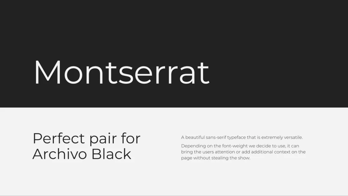
Tone of voice
- CalmEvery interaction should leave a client feeling supported rather than sold to.
- KindWarmth and respect first, because the audience is often starting from insecurity.
- ConfidentAssurance without bravado, so the expertise reads as trustworthy.
Lead Your Transformation
The tagline had to work as a promise to the client and as an instruction to Jessy himself. It ships on the hero and in the logo lockups, and he had it printed on shirts that he wears around the gym and hands to clients. That is the honest test of an identity: the client starts spending his own money extending it.
Off the screen
The guide did not stop at the website, because the brand was never only going to live there. It specifies the identity on print, on apparel and on packaging, so Jessy can order any of it without coming back to ask what the gold is.
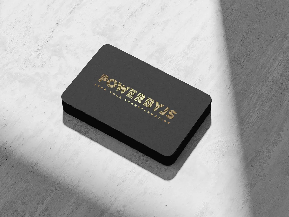
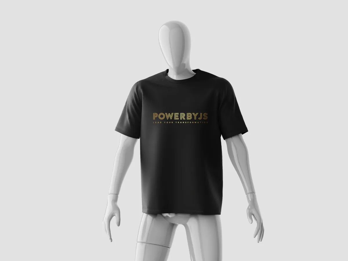
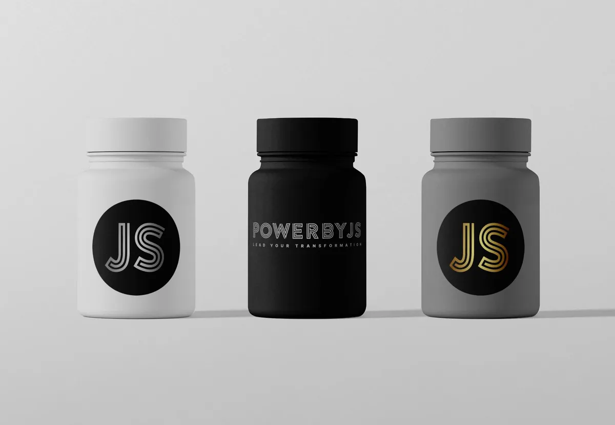
Mockups from the guide rather than photographs. The apparel is the part that left the page: he had the shirts made and they are in the gym.
Written down, in both languages
All of it is a versioned editorial document rather than a folder of exported files, because Jessy will hire other people. A photographer, a printer, someone running his ads, whoever builds the next thing. Fifty two pages, in English and in Dutch, opening with what the brand is for before it gets anywhere near a rule, then the lockups, the clear space, the approved pairings and the file types. He can hand it over and get work back that still looks like him.
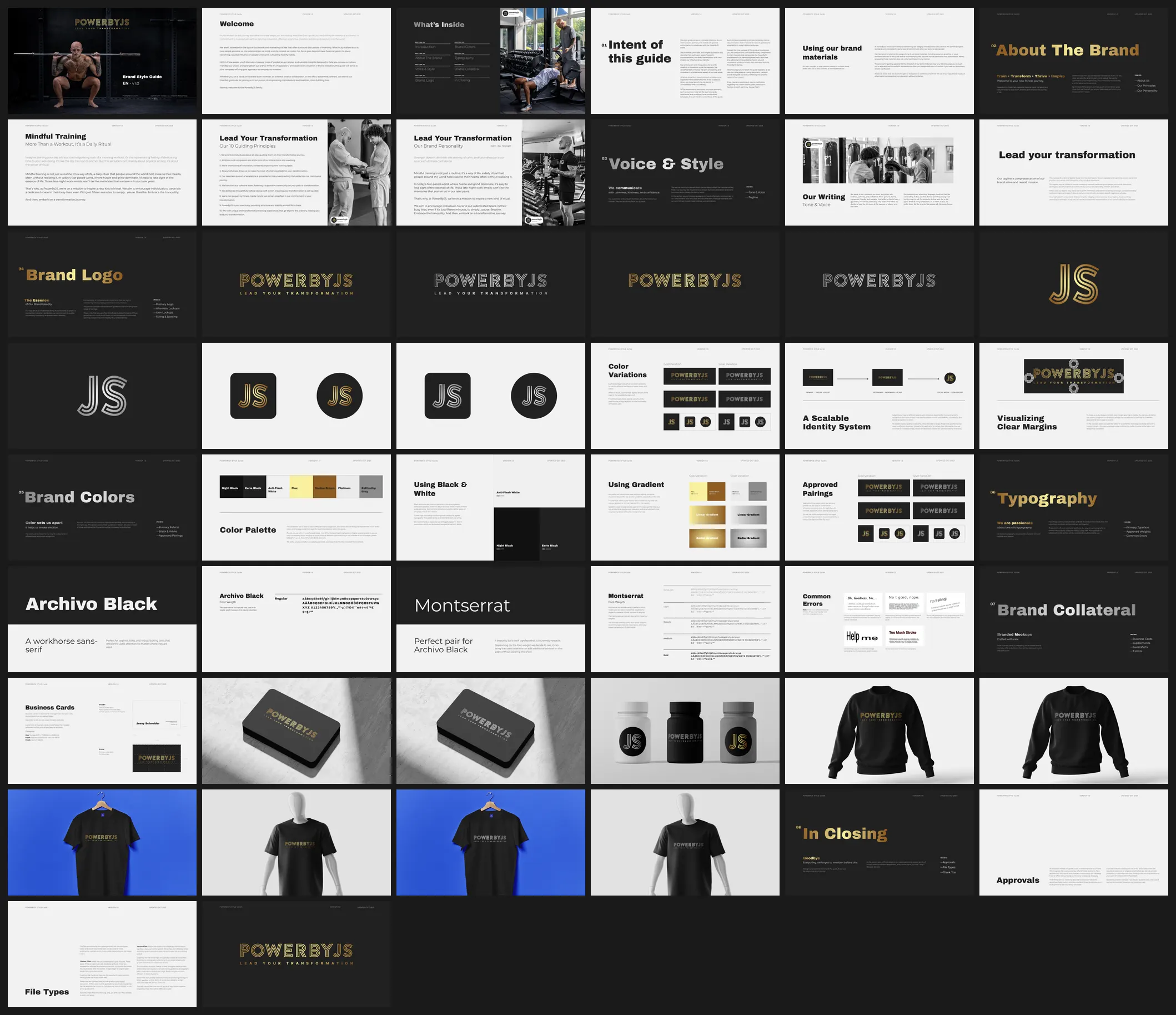
Shown without the two closing spreads, which carry his contact details.
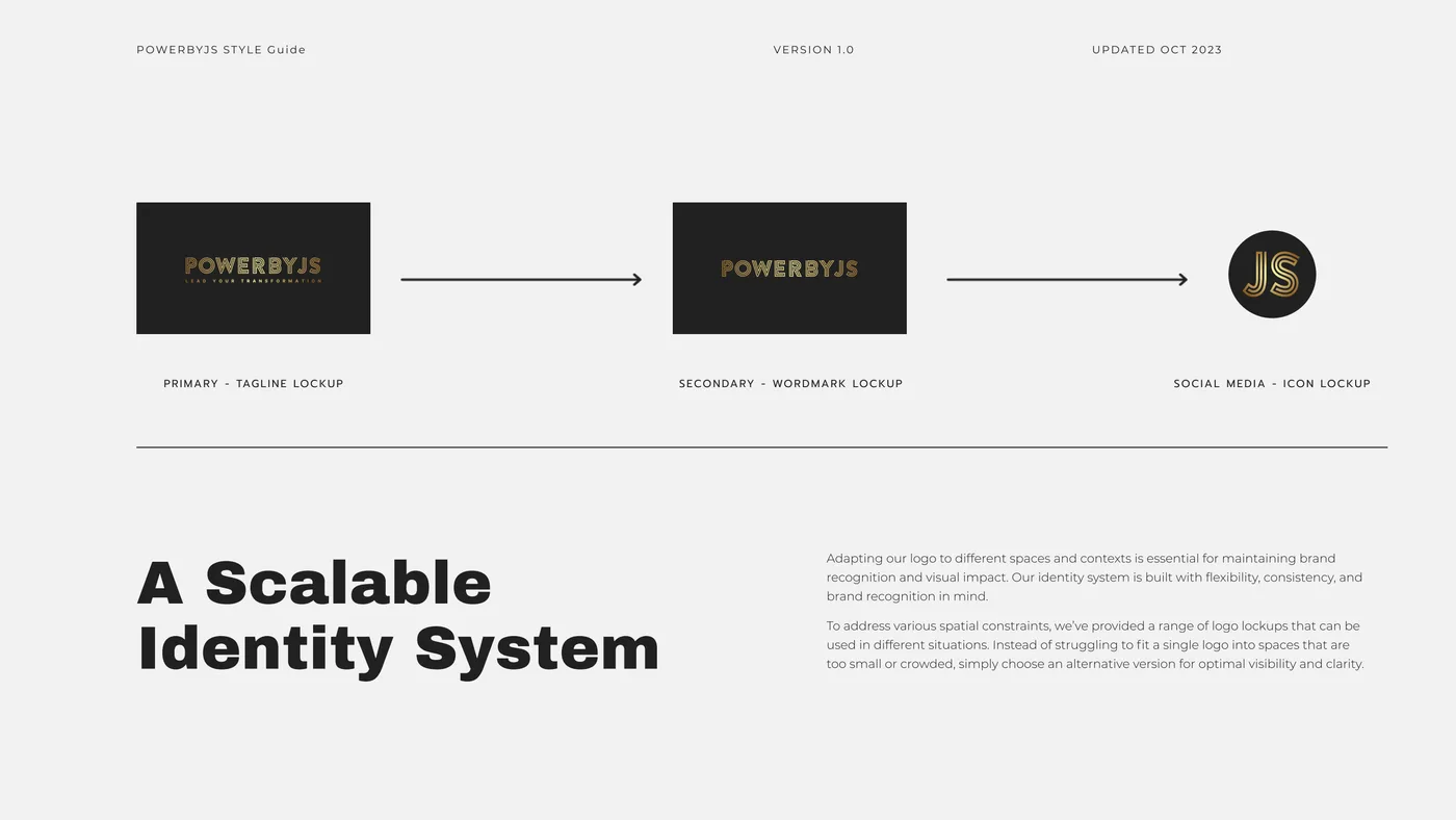
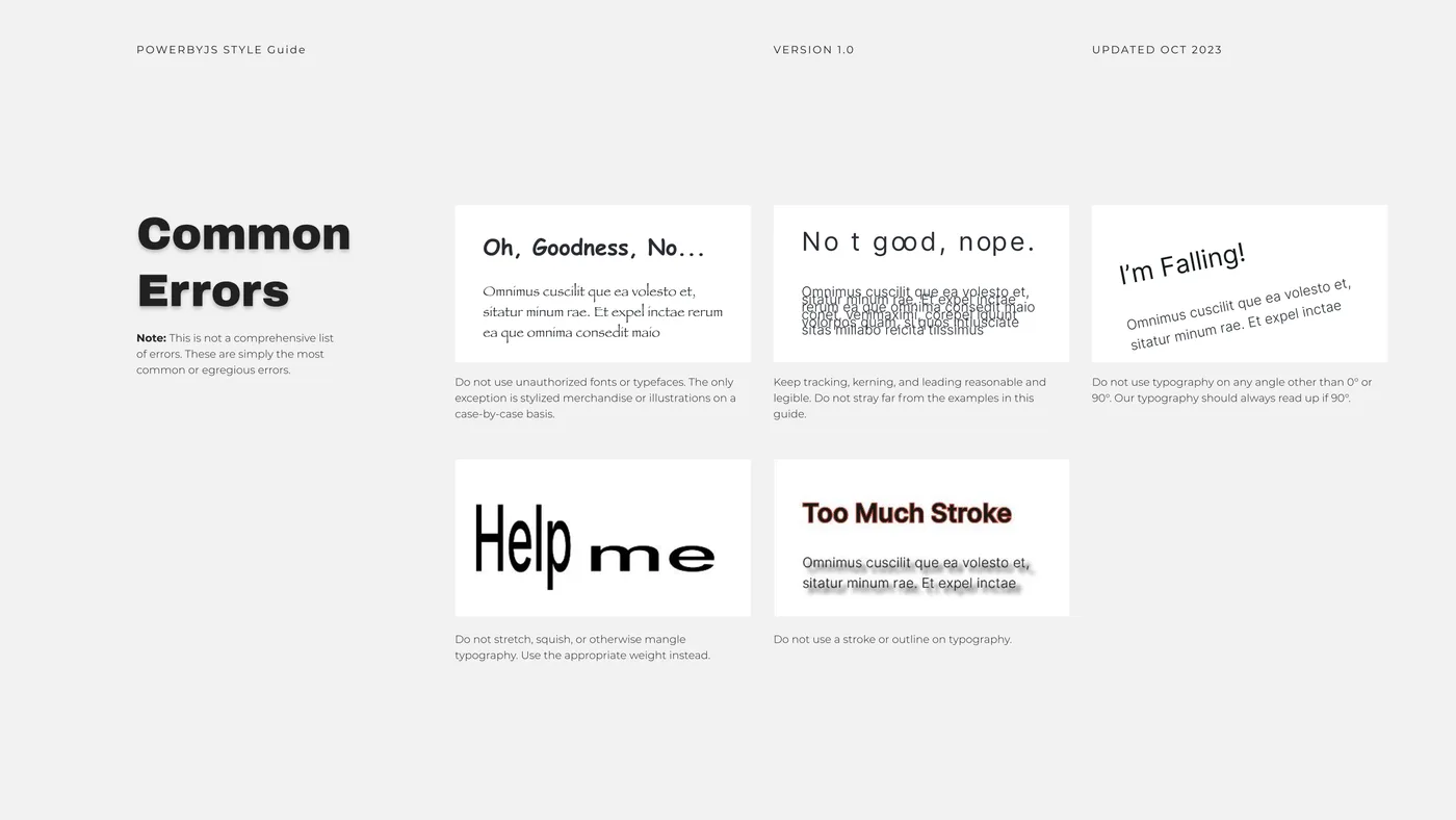
A guide that only shows a brand at its best is decoration. The half that does the work is the half telling the next person what not to do, which is the half that survives being read by someone in a hurry.
05
From moodboard to product
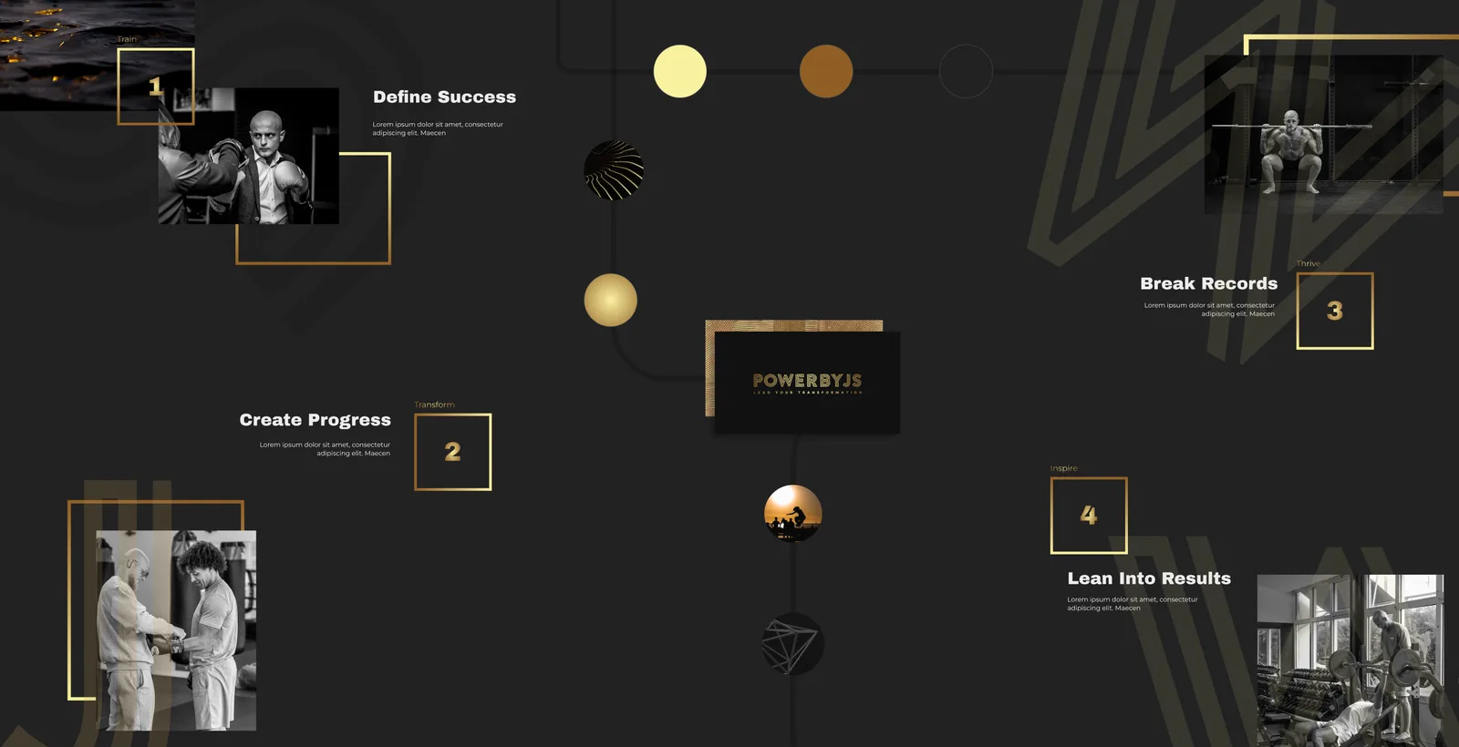
The moodboard set the register before any layout existed: dark, restrained, premium, closer to a watch brand than to a gym. Sketches and low fidelity wireframes came next, then high fidelity screens in Figma, then the build.
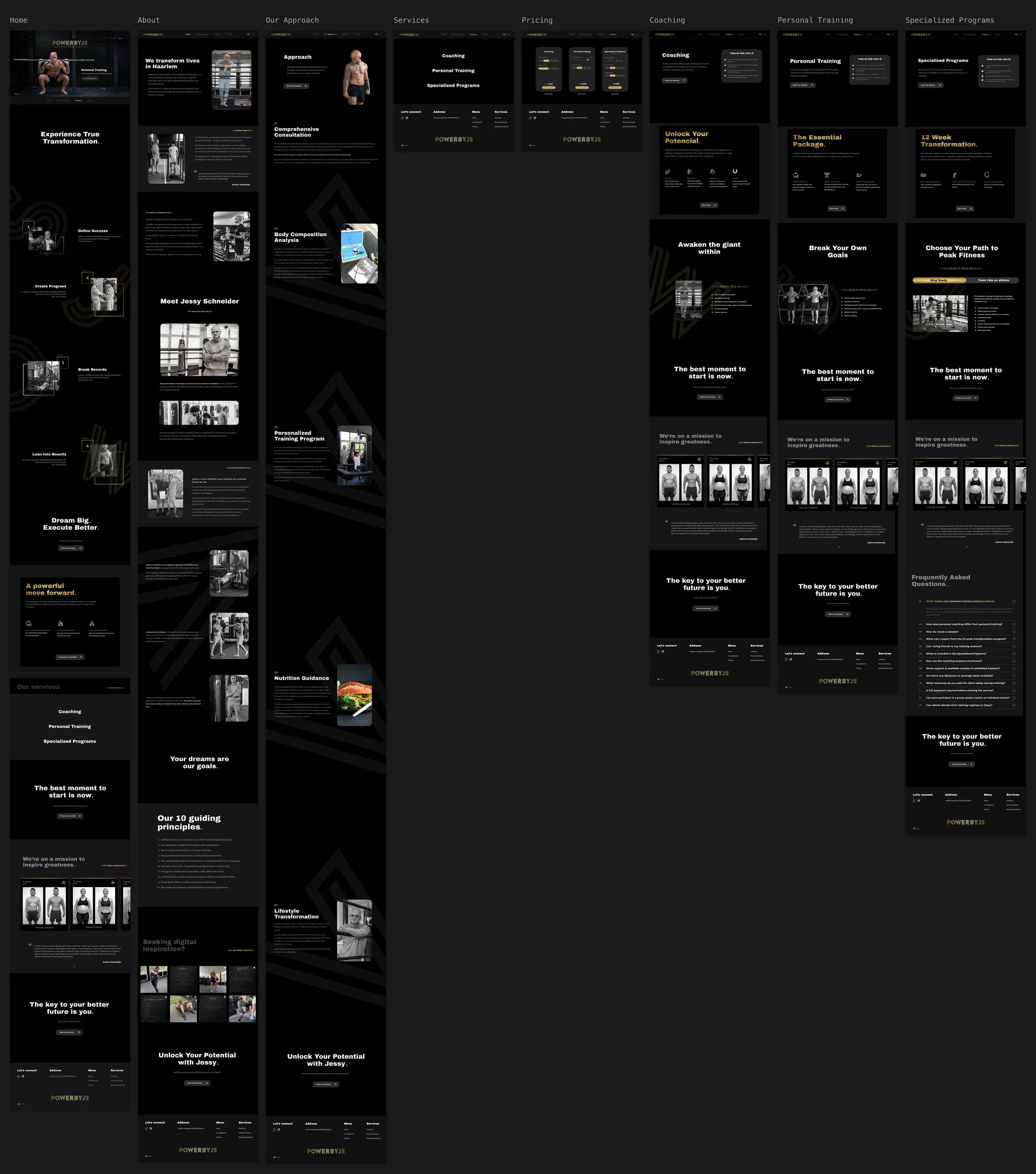
Every page was drawn end to end at full fidelity before any of it was built, in both languages and in each interaction state. The questions that normally get answered in code, halfway through building, were settled here while they were still cheap to change.
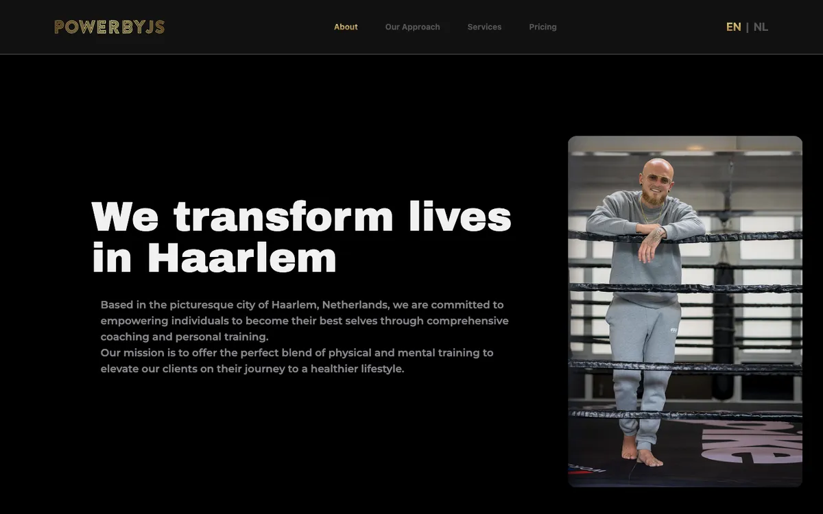
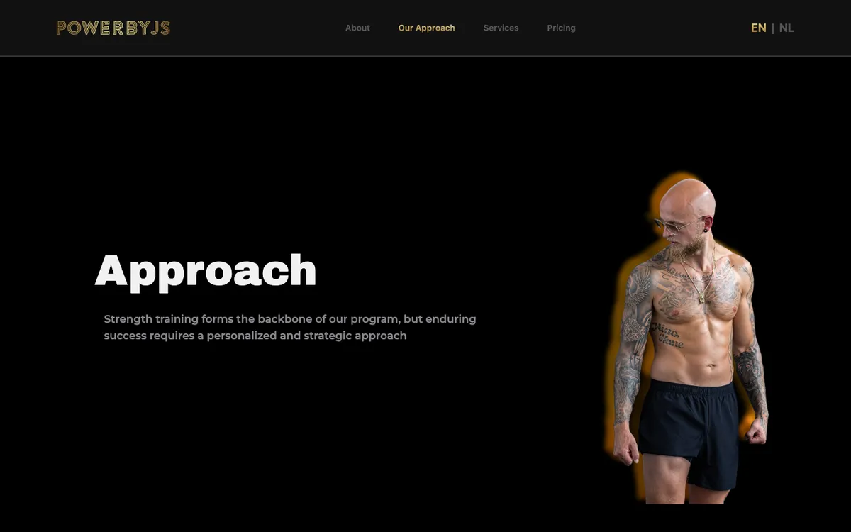
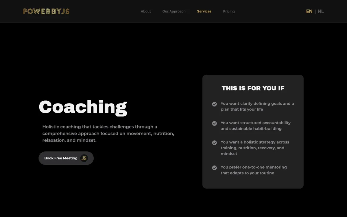
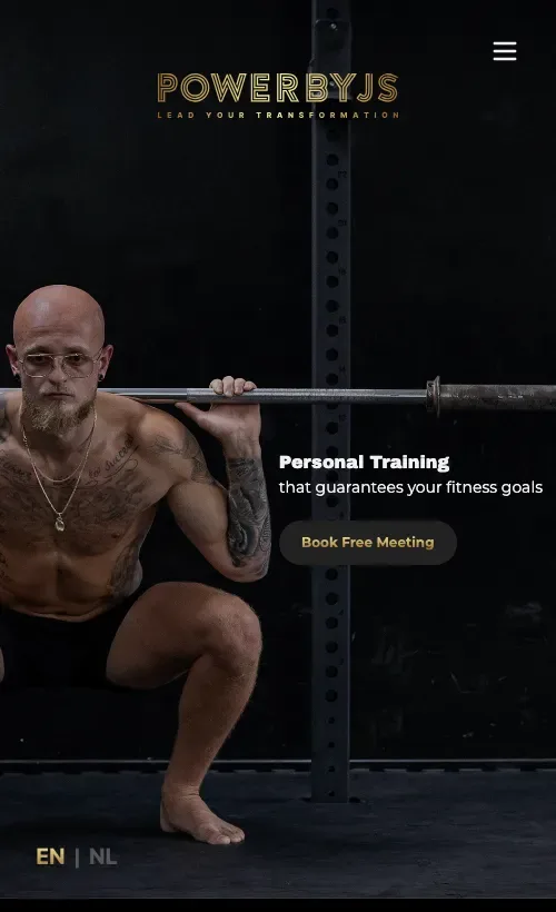
- 8 pages
- 33 components
- 2 languages
- 294 strings each
English and Dutch across eleven namespaces, at exact parity. Nothing falls back to English silently, which matters because half his market would read a missing string as carelessness.
- React 18
- TypeScript
- Vite
- Tailwind v4
- Framer Motion
- React Router
- i18next
- Headless UI
- Sanity
- Netlify Functions
- Resend
06
Three pricing engines, not one
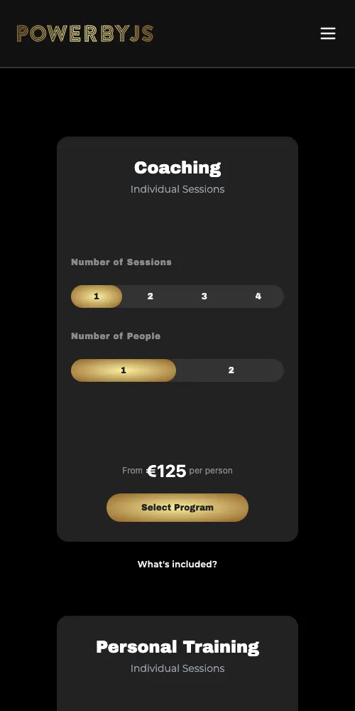
The single most useful thing on the site. His services do not share a pricing shape, so they do not share a calculator. Each card encodes the real commercial model he already sold by hand.
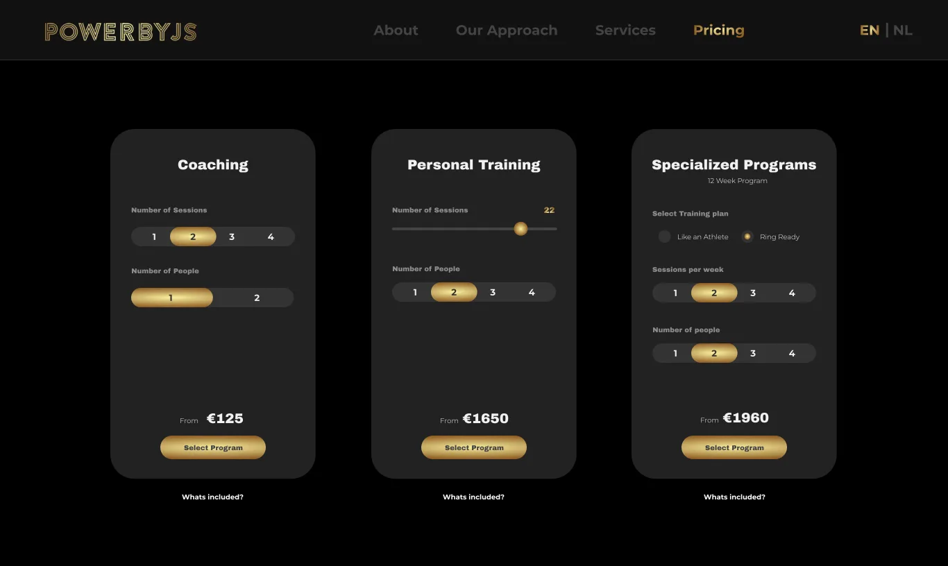
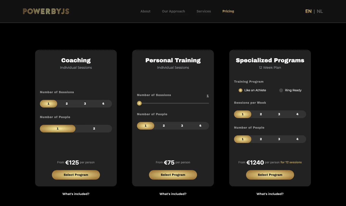
The calculators were specified in Figma down to the selected states, so the build was a matter of encoding arithmetic that had already been agreed rather than inventing a pricing model at the keyboard.
Coaching
€125 per session
sessions × €125 ÷ peopleSplit evenly when a session is shared, so two people booking together each see their own honest number rather than the headline rate.
Personal training
€75 per session
(sessions − free) × €75 ÷ peopleHis package deal is "22 sessions for the price of 20". Above ten sessions the calculator drops one from the total, above twenty-one it drops two, so the discount applies itself instead of waiting for a conversation.
Specialised programmes
€1,240 per 12 week block
weekly rate × 12 ÷ people, +€400 for a second personFour weekly intensities from one session a week up to four, running €1,240 to €3,280, with a surcharge rather than a split when the block is shared because the coaching load genuinely doubles.
The discount logic is the part I care about. Jessy's offer of twenty two sessions for the price of twenty existed only in his head and in conversations. Encoding it means the site never quotes a number he would not honour, and a visitor meets the deal at the moment they are weighing the larger commitment rather than after they have already talked themselves down to five sessions.
07
What lands in his inbox
A calculator that forgets its own answer the moment someone clicks Contact is a toy. Whatever the visitor configured travels into the enquiry.
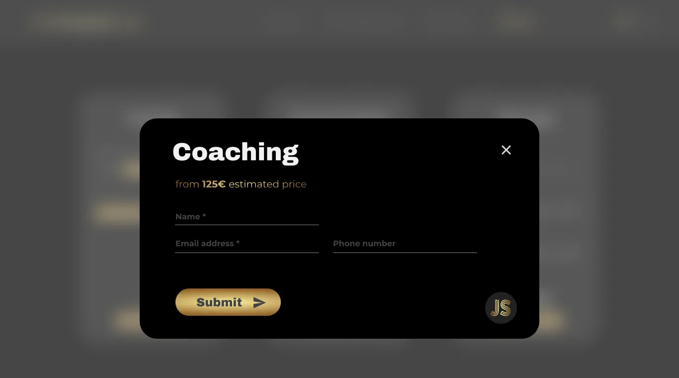
The enquiry modal opens over the calculator and carries the estimate with it, so nobody has to retype what they just chose. What it shows the visitor is what it sends.
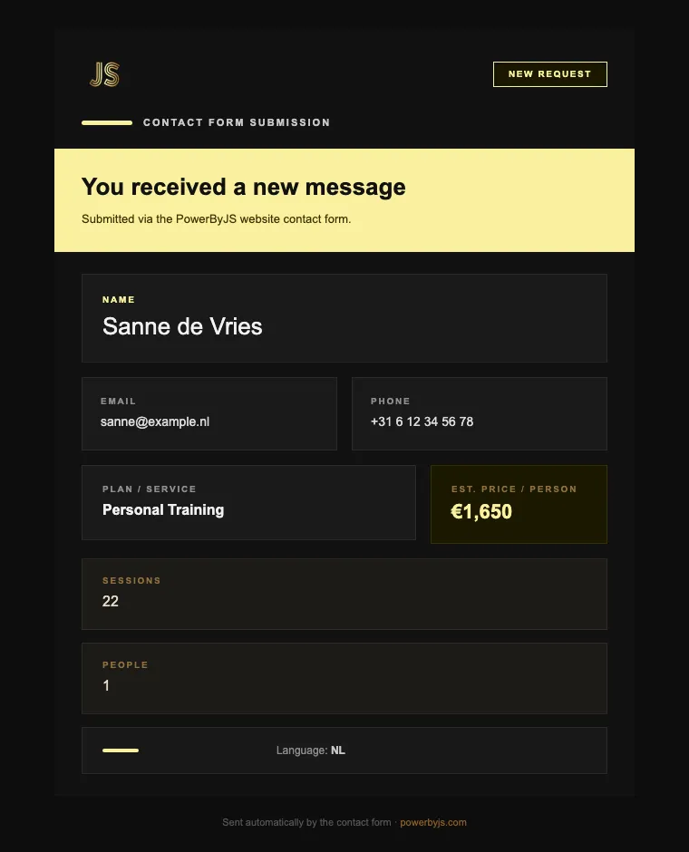
The form posts to a Netlify function which sends through Resend, with the visitor's address set as the reply-to so Jessy can answer from his inbox. The email itself is hand built table markup in the brand palette, because mail clients each render modern CSS differently and a broken layout is what most contact form emails actually look like.
The effect is small and it matters: he opens a message that already tells him the plan, the number of sessions, the group size, the estimated price and which language they were reading in. His first reply can be about scheduling instead of about pricing.
08
What is in the build
Before quoting I ran a twenty one question intake covering the business, the market, and how customers actually find him. The competitor row came back as not known yet, which is the right answer from a man who spends his days coaching rather than studying the market, and it is why the research further up this page is mine and not his. He came in wanting a CMS and one page. The research came back with four audiences, two languages and three ways to buy. I wrote the spec for that, and then I built it.
Thirty three components across eight routes. The parts worth naming:
Interface
- Scroll-linked feature reveals. Each slide owns a viewport height of track, with position and opacity driven off scroll progress, so his method is demonstrated as you move through it rather than asserted in a paragraph. That is what Dedicated Daniel came to evaluate.
- A service overlay that stays hidden until hover. All three tiers sit one gesture away from every page without spending a navigation bar, or a scroll, on them. It only mounts on pointer devices, so a phone is never offered an affordance it cannot trigger.
- Before and after cards, headed with weeks and age. Wellness Wendy needs to see someone like her, on her timescale, rather than an athlete.
- A testimonial carousel with autoplay and wheel gestures, linking out to the originals rather than reprinting them.
- An FAQ accordion built on Headless UI disclosures, keyboard and screen reader correct without hand rolled ARIA. It answers the price and commitment questions that people will not send an email to ask.
Content
- Every section backed by Sanity, so the copy, the prices, the testimonials and the transformation photographs are all his to change.
- English and Dutch in full. 294 strings at exact parity across eleven namespaces, pluralised properly rather than concatenated, so a Dutch reader never lands on an English fragment.
- Transformation photographs served through Sanity's image pipeline, with format negotiation on and cropping off. A before and after photograph that the CDN has decided to crop is no longer evidence of anything.
Conversion
- Three pricing engines, one per service, each with its own arithmetic.
- A contact modal reachable through context from any component, so every call to action on the site lands in the same place and arrives carrying what the visitor had configured.
- Delivery through a Netlify function with reply-to set to the visitor, so he answers by hitting reply.
Then the half nobody notices until it is missing: scroll position reset on every route change, a real 404 rather than a blank screen, and the services typed such that adding a fourth one without its copy fails the build instead of rendering an empty panel in front of a customer.
09
Handing it over
The one thing he asked for by name was the ability to run it himself, so that is the part I refused to compromise. Content he needs to change sits in Sanity. He got written documentation covering the accounts, the logins and how to edit each type of content, written for someone who does not work in software.
I have not been the bottleneck on his own website since it launched, which is the outcome I was actually aiming for.
10
Honestly
I overdelivered here deliberately. He is a genuinely good coach in a crowded market and the brief he wrote would not have helped him, so I built the thing that would. That was my choice and I would make it again.
What I would change is the sequencing. Brand and design ran well ahead of any code, which is defensible, but it meant the first thing he could actually click arrived late. Now I would ship a small real site early and let the research keep improving it, so the client has something working in the market while the deeper work continues.
The site is live, he updates it himself, and enquiries reach him with the details already filled in.